
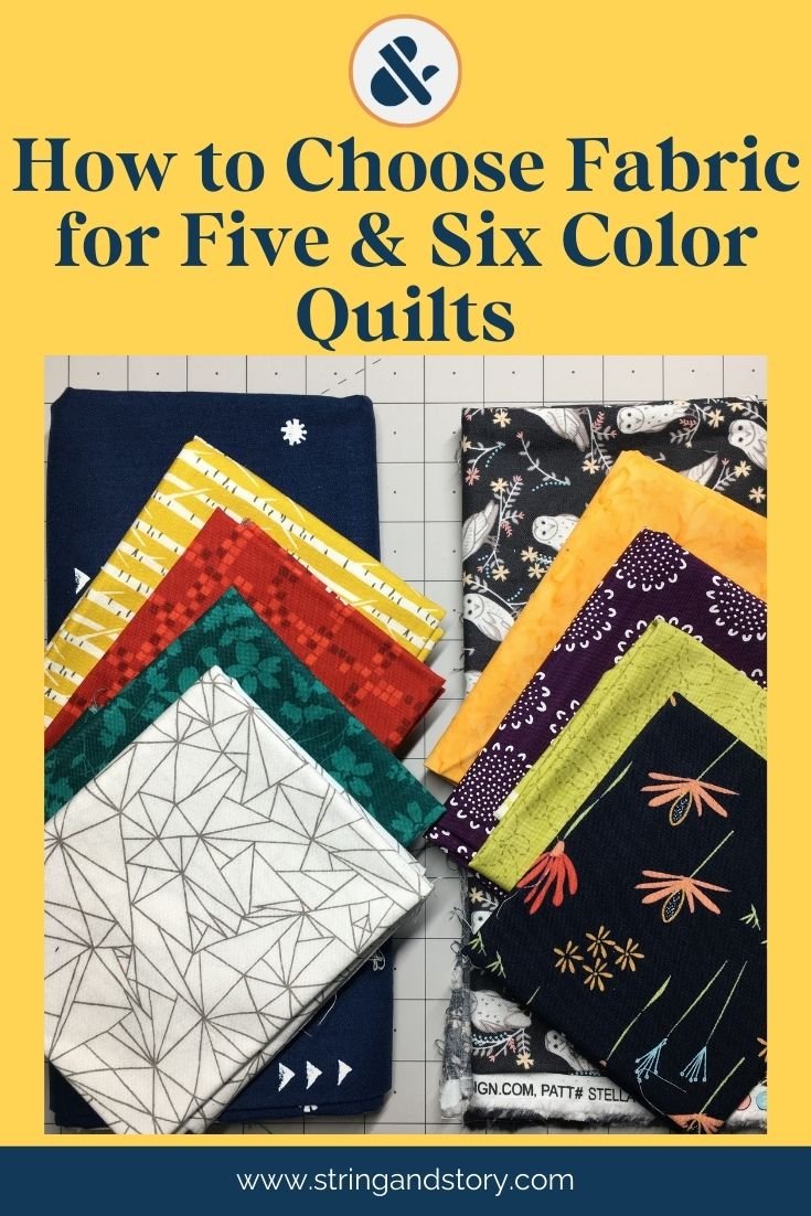
How to Choose Colors for Five and Six Color Quilts
Five or six colors / fabrics is about the most you’ll usually find in the quilt making world. In fact, five or six colors is a pretty broad color palette, so I’m going to teach you some tricks to keep this from feeling overwhelming!
(This post may contain affiliate links)
There are a couple of ways to choose five or six different fabrics for your quilt. You could go monochromatic (lots of shades of the same color; often called a color wash), choose analogous colors (all next to each other on the color wheel), pairs of complementary colors… I’ll share examples of these with you below, but there’s also another secret for five and six color quilts:
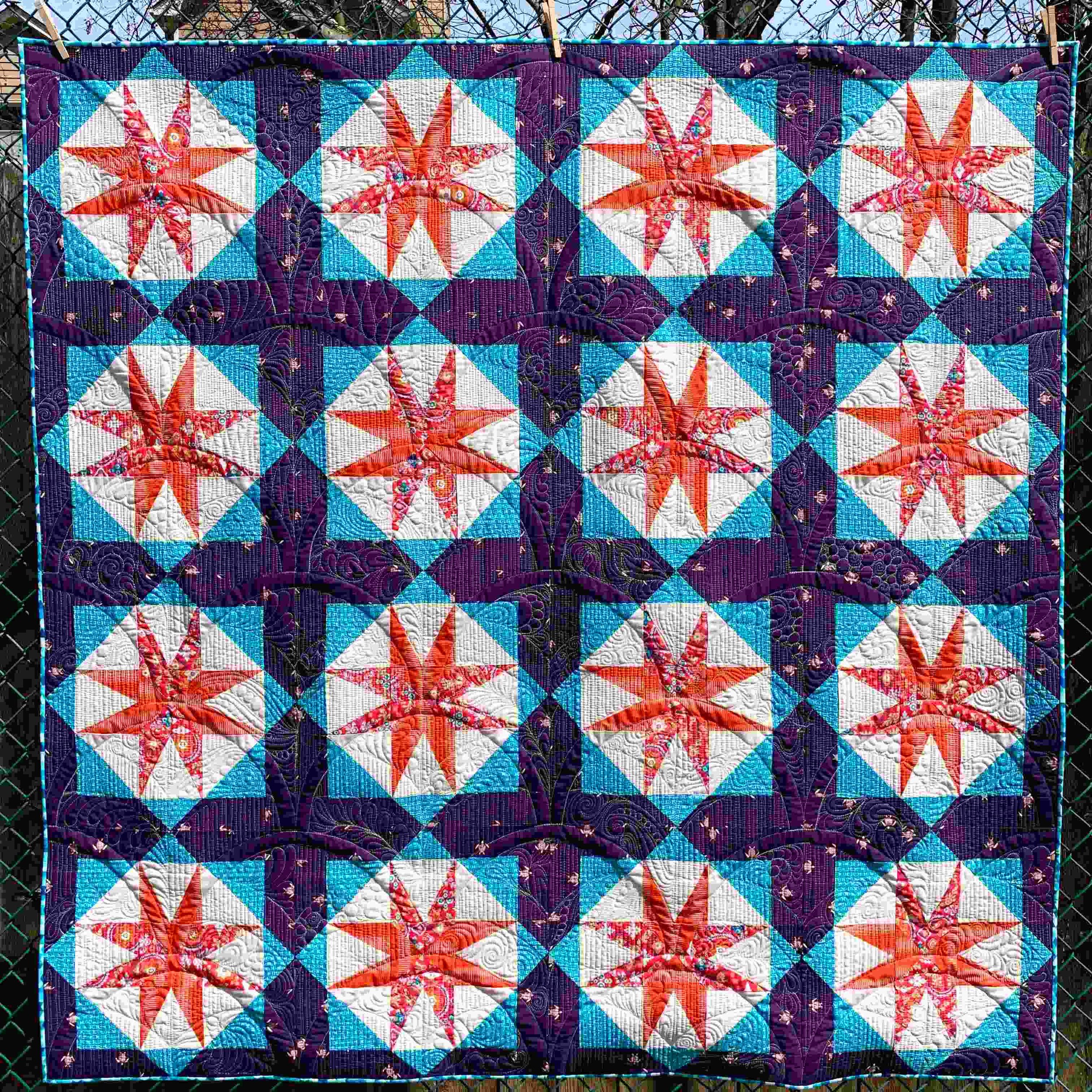
Often, five and six color quilts are three or four color quilts plus neutrals. A great example from the time of this original writing is Bonnie Hunter’s 2018 Mystery Quilt, Good Fortune, which is four colors plus a neutral for the background. Similarly, my own Star Island Quilt (shown above) is essentially a three color quilt with two neutrals (one for behind the star and one for the “sashing” behind the lantern). Let’s go step by step through the ways you could pull fabric for these quilts.
Value

Gradient and transparency quilts can use five or six colors at a time. I chose to show you examples with prints as a caution: those middle tones can get close and busy quickly with this many fabrics, especially with prints. Choose your fabrics carefully, or consider working with solids if you want a color wash across this many fabrics. Below is my Lanterns of Hope pattern made with Ruby Star Society’s Water line from 2024. It’s a great example of using prints to successfully pull of a color wash.

Alternatively, you could continue to riff on the idea of using fewer colors, but use two different values of each to fill out your fabric pull. I’ll likely sound like a broken record by the end of this post: five or six different colors is a LOT (this is why most people default to a rainbow palette for quilts with this many colors), and looking for opportunities to simplify is not cheating— it could mean the difference between a WOW quilt, and one that feels overwhelming. All that to say, if you’ve got five or six colors chosen, and you are OH YES BABY about them, go for it! But if that feels like SO MANY, don’t be afraid to simplify.
Color


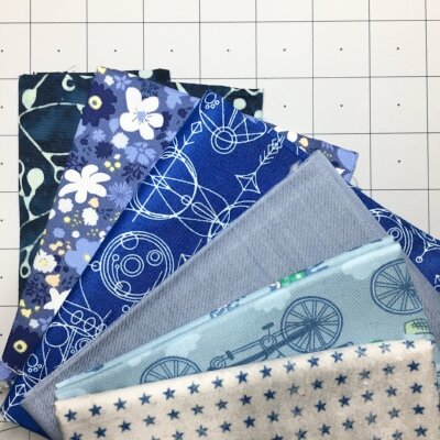
There are a couple of ways to vary color when working with a palette this large. The first is an analogous color scheme. Analogous colors are next to each other on the color wheel. It can be tricky to use more than 5 analogous colors (you’ll see in the pull on the right that there isn’t much contrast between the yellow and the yellow-green), so consider working with 5 and adding a light or dark neutral to your palette if you need six colors.
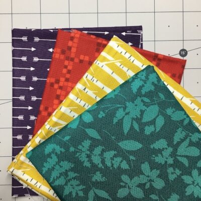
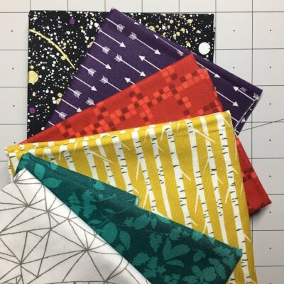
Second, you can combine smaller “units” of color contrast to make a bigger fabric pull. Above, you’ll see I chose two pairs of complimentary colors (also called a tetrad), then on the right I added black and white to make a 6 color pull. You could do three pairs of complements/ two triads (this is basically a rainbow quilt). You could also do a split complementary (a color and the two colors on either side of its complement on the wheel: Violet, yellow orange, and yellow green) plus two neutrals for a five color quilt or two split complementaries (which is like three analogous colors from each side of the color wheel. ie: blue-violet, violet, red violet, yellow-orange, yellow, and yellow-green) for a six color quilt.
Scale
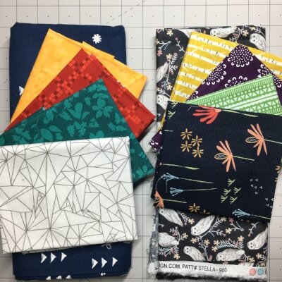

Scale is more important than ever when there are lots of colors happening on a quilt. Remember, too many variables gets busy quickly! On the far left, you’ll see a pull that’s not solids, but is nice and “safe.” Using tonal prints if you’re feeling hesitant is a great way to add movement to your quilt without things getting too overwhelming. Second from the left, you’ll see a pull that is made almost entirely of large prints. While I like the colors of this pull, the prints feel like a bit much. In the right photo, you’ll see that I mixed up these two pulls to balance the scale of each resulting in a punchier but still conservative pull on the left and a bit more jazz on the far right. Note bene: Those owls could be problematic because of the high contrast in the print, so their compatibility would be determined by the size of the piecing you’re going to do
Conclusion
Many traditional and modern-traditional quilt patterns call for five or six colors, but that can feel overwhelming. When you feel confident, embrace the variety! When you are less sure, look for ways to simplify your palette and fill in with different values of the same colors or with neutrals. Using solids instead of prints is another way to simplify the process. All in all, don’t forget to relax and enjoy the process!
Resources
FREEBIE: Choosing Fabrics Quick Guide
PATTERN: Lanterns of Hope
PATTERN: Star Island
Share this blog if you found it helpful: