
Why Contrast Matters When Choosing Colors for Your Quilts
Making sure you have enough lights and darks in your quilts is important, but so is creating other types of contrast with color and scale. Learn how to pick a “home run” fabric pull with these easy steps!
(This post contains affiliate links)

“Make sure your quilt has enough contrast.”
“Are you sure this has enough contrast? Did you take a black and white picture?”
“I’m scared to use too many prints— what if there’s not enough contrast?”
“If I choose my own fabrics, how do I know there’s enough contrast?”
”I mostly just use kits— I’m scared that I don’t know how to put enough contrast in my quilts if I choose my own fabrics.”
Any of these sound familiar? Maybe all of them? “CONTRAST” is the world’s biggest buzz word when it comes to colors and fabrics for quilting. On the one hand, contrast is really important, and I’m glad people are talking about it. On the other hand, it’s more complex than just taking a black and white picture of your quilt to make sure that some areas are significantly lighter and darker than others.
In an effort toward a more nuanced view of contrast, let’s look at a few ways that you can create contrast in your quilts:
Overview
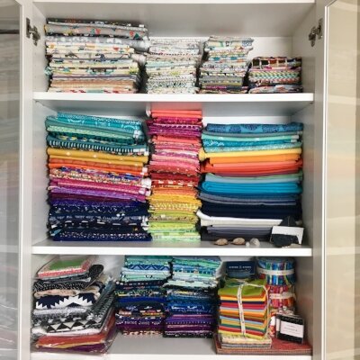
(Feel free to add this image to Pinterest to find it easily later!)

Value

As mentioned above, value contrast is what most folks are referring to when they say “contrast.” Value refers to how light or dark a color is, and taking a black and white photo can be helpful because darker colors will show up as black (or nearly so) while lighter colors show up as white (or nearly so). This grayscale simplification helps our eyes see past colors and prints.

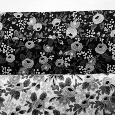
What many folks don’t realize, though, is that you can have decent value contrast and still make “muddy” quilts, especially if you’re working with prints (though this is where some quilters’ anxiety about prints comes from). As you can see above, these three prints have decent value contrast, but since two of them are similar colors (teal/blue) and they are all the same scale (in this case the exact same print), they lack visual impact. That’s why the second and third types of contrast, color and scale, are important, too.
Color

Take a step back to elementary school art class with me— these are called complementary colors (blue/orange, purple/yellow, red/green). There are also triadic colors (think: red, blue, yellow) and analogous colors (Think: blue, green, yellow). Using tools like these from the color wheel, the colors themselves play together to create a “pop” for your eyes.
Scale


Hold on to your hats, everyone! If you are nervous about using prints in your quilts, then this is the section for you! The most common “mistake” with prints is using all of the same type of print (all tone on tones, all small prints, all large prints, etc). Now, there aren’t hard and fast rules here, so don’t over think it. But do try to have a variety of types of prints in your quilts. It’s just more fun that way.


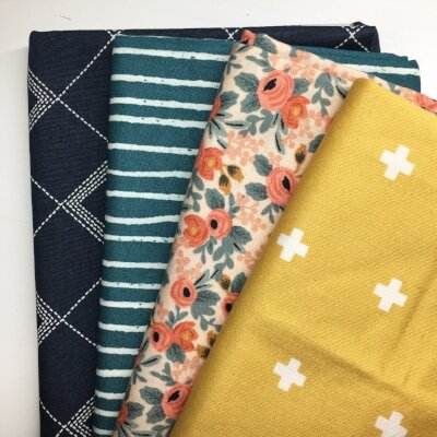
For the sake of illustration, take a look at the two fabric pulls above. On the left, the three prints are very different, but they are of a similar scale and don’t have much value or color contrast either. This is the type of print combination that runs the risk of becoming convoluted or busy when made into a quilt. On the right is a much more compelling fabric pull: I’ve added three more fabrics to draw in the yellows and pinks from the first pull and to add some calmer prints. It adds more contrast in all three categories, and this would make a really cool quilt.
One more note: If your piecing is small, it will be more of a challenge to use really big prints. That’s okay, and it’s okay to exclude larger prints from those kinds of quilts. It’s totally up to you.
“Home Run”

If you want to knock it out of the park, combine all three types of contrast in your fabric pulls whenever possible. This is why I love scrappy quilts— because I can bring lots of elements together for a really fun effect. In the examples above, I have clear lights and darks, color contrast (triadic on the left and complementary on the right), and a variety of prints. These are the kinds of pulls that make WOW quilts. and I can’t wait to see yours!
Free: A Quick Guide to Choosing Fabrics
Looking for an easy reference to keep with your stash or take to the quilt shop? Click below to get my FREE Quick Guide to Choosing Fabrics delivered straight to your inbox!