
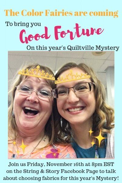
Choosing Colors for Good Fortune, A Quiltville Mystery
It’s that time of year! The color suggestions and yardage requirements are up on the Quiltville website, and the buzz is in the air! BUT, what if you don’t want to use Bonnie’s colors? Maybe they’re not your jam, or maybe you don’t have them in your stash, or maybe you’re dead set on using that new fabric bundle, or whatever. All that to say, thinking about changing your colors? You’re in the right place!
(This post contains affiliate links)
I’m pleased as punch that Bonnie asked me to share some of my knowledge about color theory regarding this year’s mystery, but first a
DISCLAIMER:
At the time of this writing (November 16th 2018), I have NOT SEEN the Mystery Quilt. It’s as much a mystery to me as it is to you! What I’m about to teach you is based on color theory and logic, not inside secrets. That means there is RISK. Changing the colors on a mystery quilt adds an extra surprise element. I don’t want you to be scared by that risk, though, I want you to be excited by it! But I also want you to know that it’s there, and that I’m operating from the same place of mystery that you are (that’s what makes this so fun!).

Video
Analysis

Color

Bonnie’s Color Pull (from Quiltville.blogspot.com)
For full fabric requirements, visit Quiltville
Bonnie suggests 5 colors for this year’s mystery: Red, orange, blue, green, and neutrals. Here are some observations about the colors (If you are unfamiliar with the three forms of contrast we’ve discussed in our How to Choose Fabrics series, you’ll find this post helpful):
Her colors are very saturated
The most value contrast exists between the four colors collectively and the neutral
There are two warm and two cool colors
There is strong color contrast (two pairs of complementary colors, also called a tetrad: red-green, blue-orange)
A tip from Bonnie: Every color is able to stand next to every other color and still have excellent color contrast.
In short, this is my kind of quilt: Punchy colors that run the show and make each other shine
Fabric Requirements
Next, I analyzed the fabric requirements. I do this by taking the yardage required for a certain color and dividing it by the total amount of yardage for the quilt. This tells me about what percentage of the quilt top will be filled by each color (Note bene: about 30% of all the fabric we pull for this quilt will get “eaten” by seam allowances, but that doesn’t really affect this exercise since we’re just getting “the lay of the land” if you will):
Greens: 8.5%
Blues: 13.5%
Reds: 12%
Oranges: 25%
Neutrals: 41%
This means as well that about 22% of Bonnie’s quilt top is cool, 37% is warm, and 41% is neutral
Changing Colors
Additional things to keep in mind
The last two mysteries have relied heavily on shapes made by keeping like colors together (especially the purples in En Provence, see my analysis of those colors here or buy the pattern from Bonnie here)
To that end, in addition to making sure that every color can stand next to all the others and have sufficient contrast, I would respect the possible pairing of blue-green and red-orange.
Percentage wise, the warm colors are going to rule this quilt. If that’s not your jam, flip your warm and cool colors
The smallest change you could make that would still totally change the look of this quilt would be to swap your light neutrals for a dark neutral like charcoal gray, black, or navy
“Safe” Color Changes
These alternate color ways use a 1:1 swap with Bonnie’s colors. Like Bonnie’s choices, these color pulls rely more on color contrast between the four main colors and the primary value contrast is with the neutral.
The left hand column is based on a triad (three colors) and uses an additional neutral (gray) as one of the cool colors. The top right uses a fifth color as a neutral. The bottom right uses gray as a neutral.


To choose your own “safe” color change, select two pairs of complementary colors and add a neutral. Or, select a triad (three colors equidistant on the color wheel), and add two neutrals— one that will play as a color and one as the background.
“Riskier” Color Changes
Remember that Bonnie chose COLOR to be her primary contrast in the foreground of her quilt top, and the VALUE contrast is between the foreground and the background (For those who followed the How to Choose Fabrics Series, the third form of contrast, SCALE, will create movement throughout the quilt top, but large multicolor prints should probably be avoided because of the size of traditional piecing). These alternate color ways are “riskier” because they add more value contrast and less color contrast to the quilt top foreground. My theory is that this could create some really cool dimension, but these quilts will have a totally different feel than Bonnie’s punchy color way.


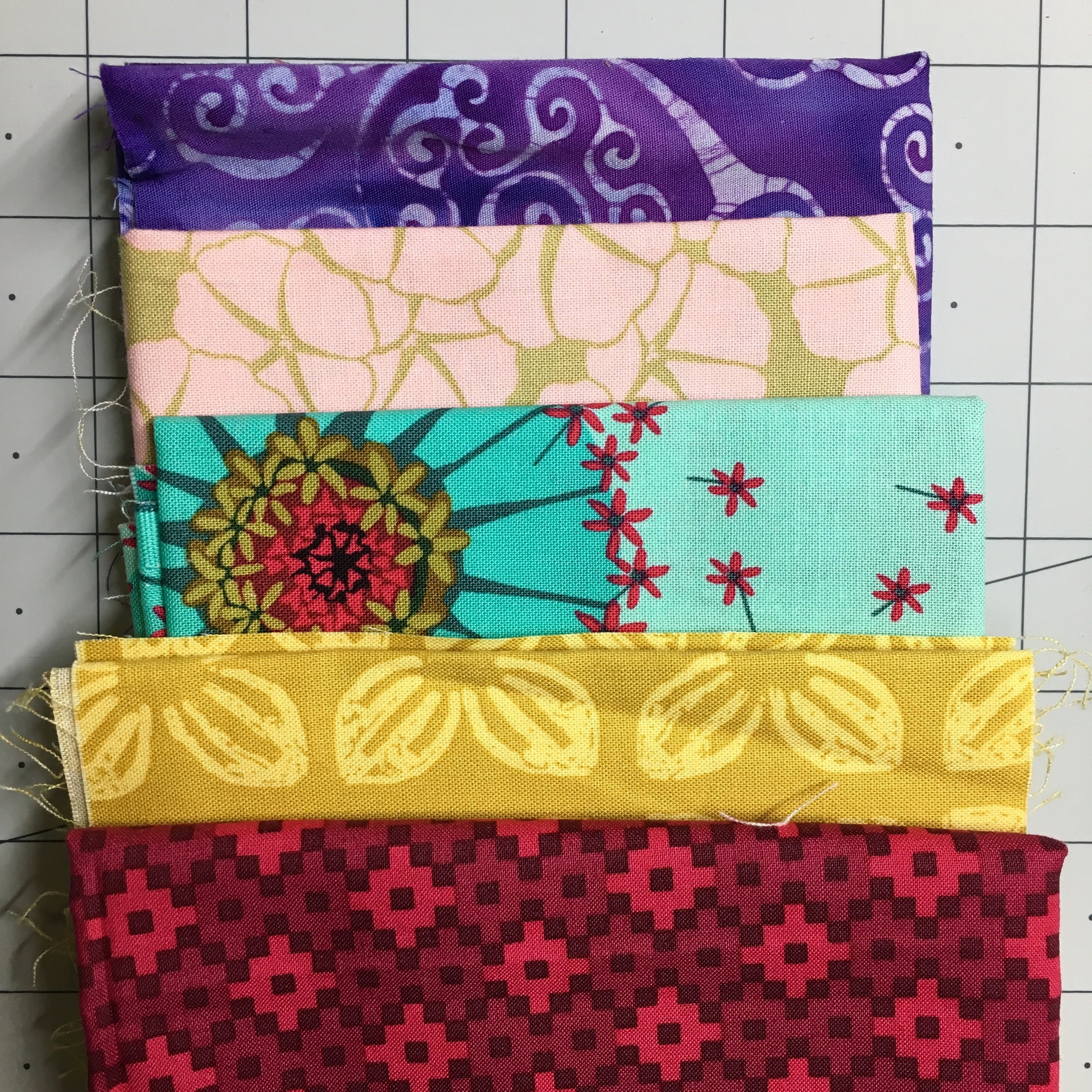
My Color Palette

I’ve been wrestling with this for weeks— the opportunities are endless! Ultimately, I decided to match Bonnie’s punchiness, but change up the colors a bit. I will also be reversing the warm and cool colors so that my quilt will have more navy, aqua, and white with punches of yellow and pink.
Final Thoughts
HAVE FUN with this. Use what you have, what you like. In the famous words of Ms. Frizzle: “It’s time to take chances, make mistakes, and get messy!” I can’t guarantee such and such outcome when I haven’t seen the quilt top, but I believe that if you follow the principles of color theory and contrast, you WILL make a beautiful quilt!