
Tips Tuesday: Choosing Colors for En Provence, A Quiltville Mystery
Choosing to change the colors on a quilt pattern can be a challenge in itself, but when it's a complex pattern, and that complex pattern is being released as a mystery, it's a whole 'nother thing! Join me as I walk through my process for choosing and changing colors on a Bonnie Hunter Mystery Quilt, En Provence.
(This post contains affiliate links)

Good Evening, My Quilty Friends!
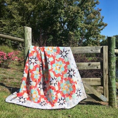
First off, thank you all so much for the overwhelming and lovely response to my En Provence Quilt! What an encouragement! The binding and label are now on, so I'm hoping for a pretty weekend so I can have a photo shoot!
In the meanwhile, many of you generously complimented my colors for this quilt and a few of you asked how I went about changing them from Bonnie's colors, especially since it was a mystery quilt, and I chose my fabrics before Bonnie revealed the full quilt. Let me break down that thought process:
(Before I jump in, this process will work for any quilt pattern, and is especially useful if you don't have a coloring page to "audition" colors in the design or if you want to make a pattern "scrappy.")
First, for me, changing the colors was originally rooted in necessity. We bought a house right about the time the mystery kicked off last year, I didn't have enough of Bonnie's colors in my stash, and there simply wasn't money for me to go buy enough fabric for the whole quilt. Thus, I started by assessing what I had, then made a few purchases to round things out.
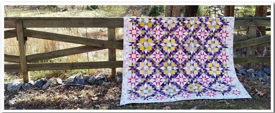
Bonnie Hunter's En Provence. Image from her website (click to visit)
With that disclaimer aside, let's look at Bonnie's palette and fabric requirements:
Impulsive Purple (Dark Purple)- 2 yards
Magical (Light Purple)- 1.5 yards
Garden Spot (medium green)- 1.5 yards
Afternoon (medium yellow)- 2 yards
Neutrals- 4.5 yards
Magenta (constant)- 1.25 yards
The yardage is important because, while we may know at the beginning of the mystery where in the quilt each of these colors will land, it does tell us what color(s) will dominate the quilt. In this case, I knew that purples made up about 25% of the quilt, neutrals were about 35%, and while magenta was only around 10%, the description "constant," along with the encouragement to choose only one fabric here (rather than going scrappy), suggested to me that magenta would be distributed evenly around the quilt.
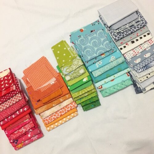
If you look closely, you'll notice that a few fabrics didn't actually make the "final cut" into the quilt once I chose my navy print and reoriented the palette around it
To break it down simply, I used the following colors:
Strawberry (medium pink-true red)
Oranges (light to rich)
Green (mostly brighter greens)
Turquoise
Gray/white Neutrals
Navy print (constant)
As I mentioned above, the color changes were originally driven by necessity, but as I got going, I put a good bit of thought into which fabrics I used and why:

Strawberry/Orange: These were the colors most determined by necessity. Typically a cool color girl, I had an excess of these warm colors in my stash, particularly the reds. I chose orange as its pair because they play nicely together but still have some visual contrast.

Green: I love green, so I used green just like Bonnie did.
Turquoise: Where Bonnie chose yellow (I presume) as a warm contrast to her cool purples (and purple's complimentary color), I chose a cool turquoise as a contrast to my warmer reds and oranges (blue is the compliment of orange).
Gray/White Neutrals: I lean toward a modern aesthetic, so I knew this family of neutrals would give my quilt a more modern feel. Plus, I had enough in my stash!

Navy Print (constant): Originally, I had planned to use a solid navy as my constant because 1) I think navy is the world's best "neutral," and 2) it's nice and dark to provide a rest from all the CHEERFULNESS of the rest of this quilt (because, let's be honest, this is a bright puppy!). As an added bonus, Desert Bloom by Sherri and Chelsi for Moda had just come out when I went to the fabric store. The navy print I chose has lovely little flowers-- in red, orange, green, and turquoise-- on it! It was totally meant to be. I used this print for both my constant and my binding (it also would have been a phenomenal backing, but I didn't buy enough. alas).

Two last thoughts:
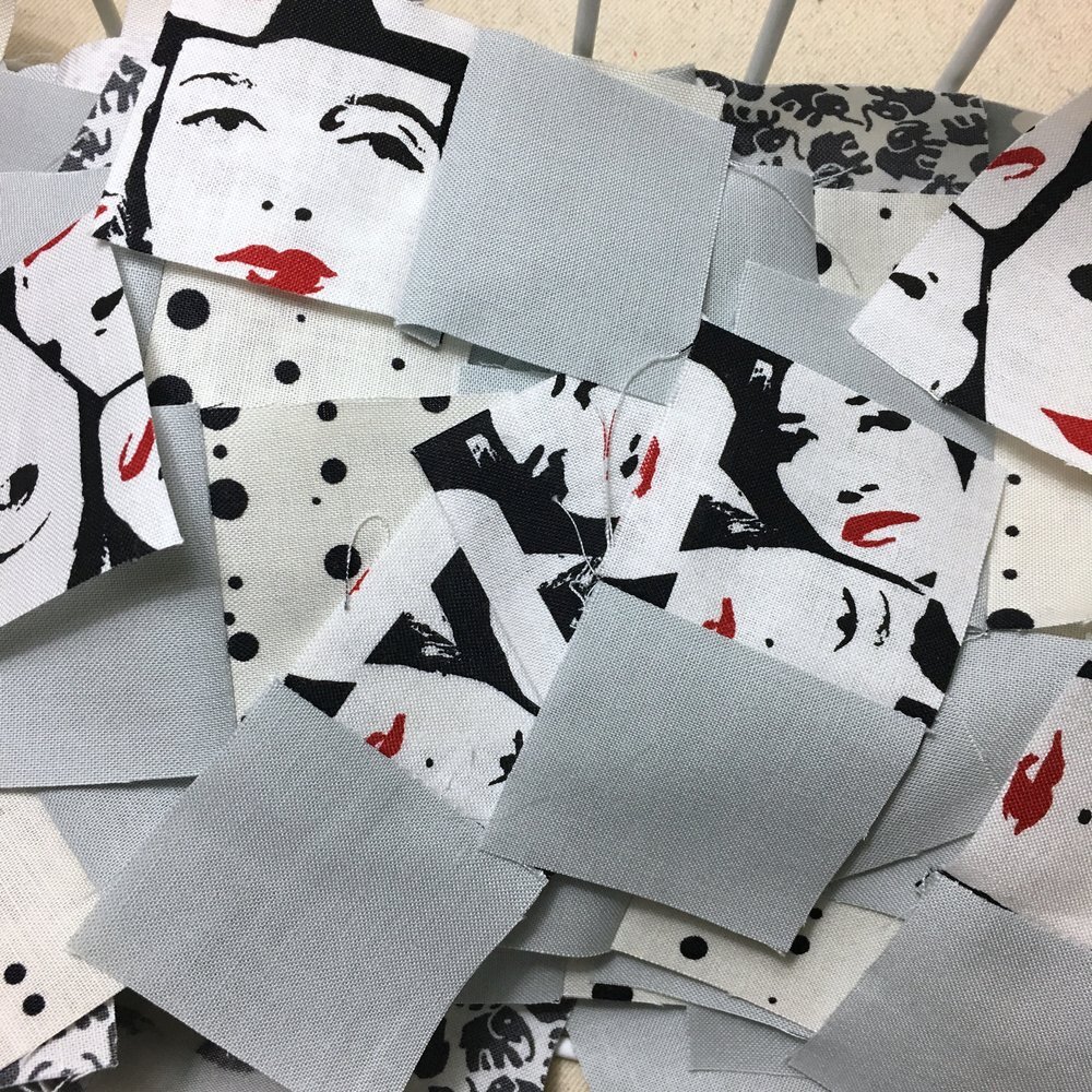
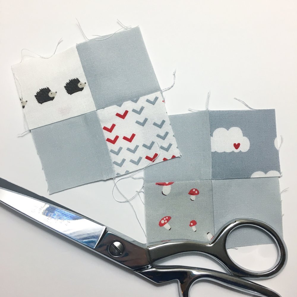
1) Once I knew that red/pink/orange was going to be the dominant feel of the quilt, I let that guide which prints I used of other fabrics. I've already mentioned that all the colors show up in my constant navy print, but there's also pops of red in my neutrals (like that face print with the red lips that I still can't get enough of! I bought a fat quarter of it for this quilt because I think it's equal parts hilarious and wonderful) and in the turquoise prints (red flowers). I really think this is how I "got away with" using so many really bold prints in one quilt. Seriously, in addition to the faces, there's silverware, mustaches, buttons, sheep, hedgehogs, mushrooms, elephants, and more hidden in this quilt, but the strand of red throughout helps everything play nicely.
2) Most of my fabrics were fat quarter cuts. I mention this only because I think it helped everything stay balanced. All the fabrics appeared enough times in the quilt to "belong" but only the navy shows up "constantly." Fat quarters were the perfect way to get a scrappy look while also having what I now recognize as a pretty structured thought process.

There you have it, my friends! I hope this helps you choose gorgeous fabrics not only for Bonnie's magnificent mysteries, but for all of your quilty adventures. Also, a special shout and thank you to Bonnie for writing such a gorgeous mystery!
Yesterday I wrote a post about my quilting plan for En Provence. If you haven't read it yet, I think you'll enjoy that, too, and find it useful, once again, for all your quilty adventures.