
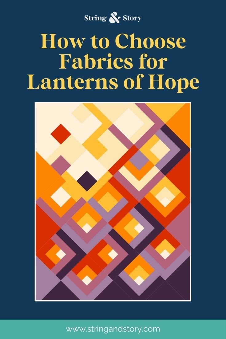
How to Choose Fabrics for Lanterns of Hope
Lanterns of Hope is a modern traditional deconstructed log cabin quilt set on point. It has very large setting triangles, and much smaller block centers, as well as a whopping eight colors. Let’s use the key principles of value, color, and scale to discuss ways to choose colors and fabrics to make your Lanterns of Hope quilt.
In my experience, eight colors is a lot for a quilt. As a shop owner, I observe that many folks get overwhelmed if a quilt needs more than five colors or fabrics. Since I had the audacity to write an eight color quilt pattern, I’m also here to help make the color and fabric choosing process as fun as possible!
I think the strongest fabric choices combine the contrasts of value, color, and scale. For an eight color quilt (because that’s a lot), I recommend leaning heavily on either value or color contrast, and then incorporating the other forms of contrast.

Value
Value contrast is the distinct “light and dark”contrast that is often discussed in reference to using a black and white filter on your phone camera to look at your fabric choices. As Lanterns of Hope is all about the idea of light rising from the bottom right of the quilt toward the top left of the quilt, it makes sense that value is an important consideration when choosing fabrics.
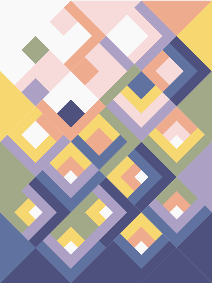
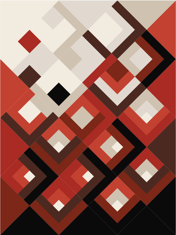
One way to incorporate value contrast into Lanterns of Hope would be to create an eight tone wash or ombre of a single color. This would be a way to lean heavily on value contrast like I referenced above. I used value to choose eight prints from the Ruby Star Society Water collection to make a blue color wash Lanterns of Hope.
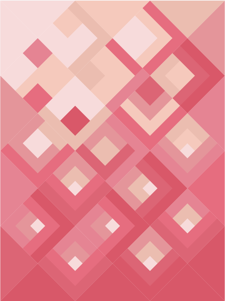
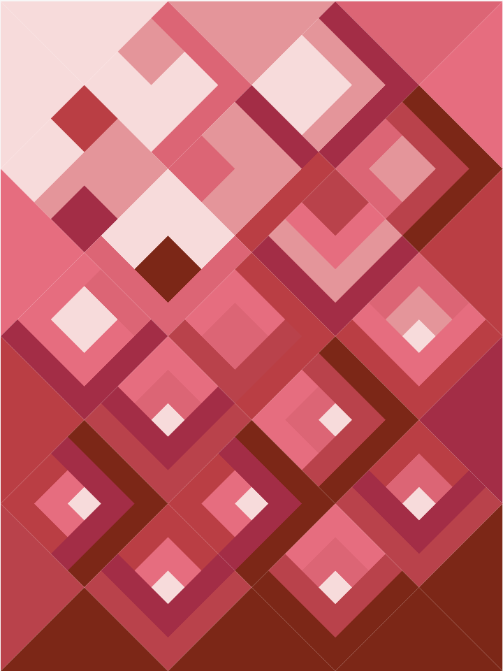
As you can see from the example above, value is essential in creating a visually compelling quilt, especially if you’re only working with a single color. While some areas of low contrast can create visual blending and movement across the quilt, the overall lack of strong contrast in the first example on the left creates a much less interesting quilt.
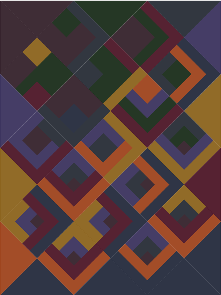
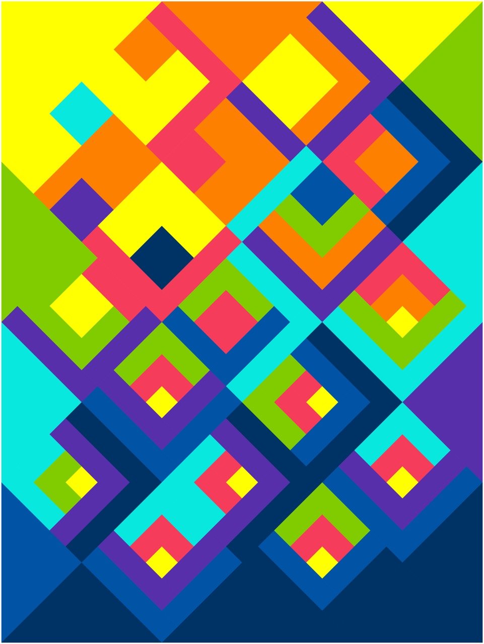
You can also use value in a version of Lanterns of Hope that uses more than one color. Both of these quilts use roughly “ROYGBIV” or the rainbow to create their palette. The first example on the left, however, has colors of all very similar values. Viewed through a black and white filter, only two or three values would be distinguishable. Nearly all eight values would be apparent, even in black and white, for the second example on the right, however.
Whether you are working in monochrome or full color, solids or prints, a full range of value contrast is critical to a successful Lantern of Hope quilt.
(Disclaimer: I have seen many lovely low volume and low contrast quilts. You can, of course, choose to create a low contrast Lanterns of Hope if that’s what strikes your fancy as long as you keep in mind that the block shape and pattern will be much less visible. It is my general experience that most folks want a pretty high level of contrast with this pattern)

Color
Depending on your school-age experience with color theory, you may find this section exciting or overwhelming. In color theory terms, we could talk about choosing a color triad (such as red-blue-yellow or orange-green-purple) and choosing multiple values of each color. We could also talk about choosing a quadratic (such as violet-blue-yellow-orange) and choosing just two values of each. Is your head spinning yet?
If color wheels aren’t your thing, I have two simpler techniques to try:
1) Pick two “neutrals”– whether or not these are truly neutrals as we often think of them isn’t as important as one being very light and one very dark. For the Citrus Rainbow Lanterns of Hope above I chose pineapple and navy. Then, choose three warm colors (pink, orange, and aqua) and three cool colors (blue, purple, and green). Notice that the aqua and the green are both in that hazy zone of “is this warm? is it cool” which, along with value, creates visual stair steps across the quilt.
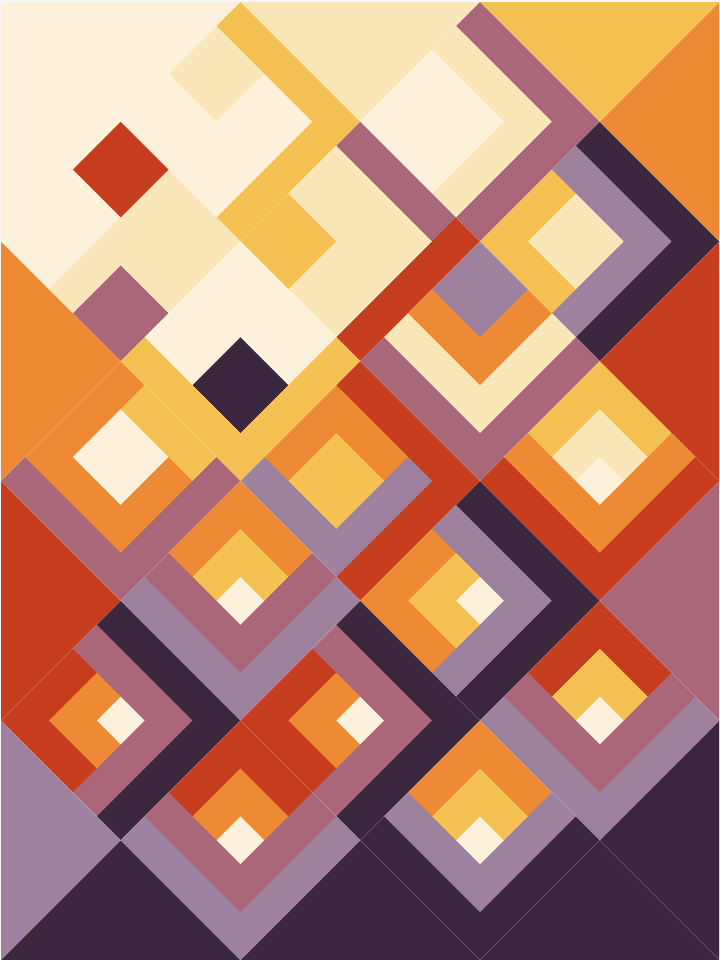
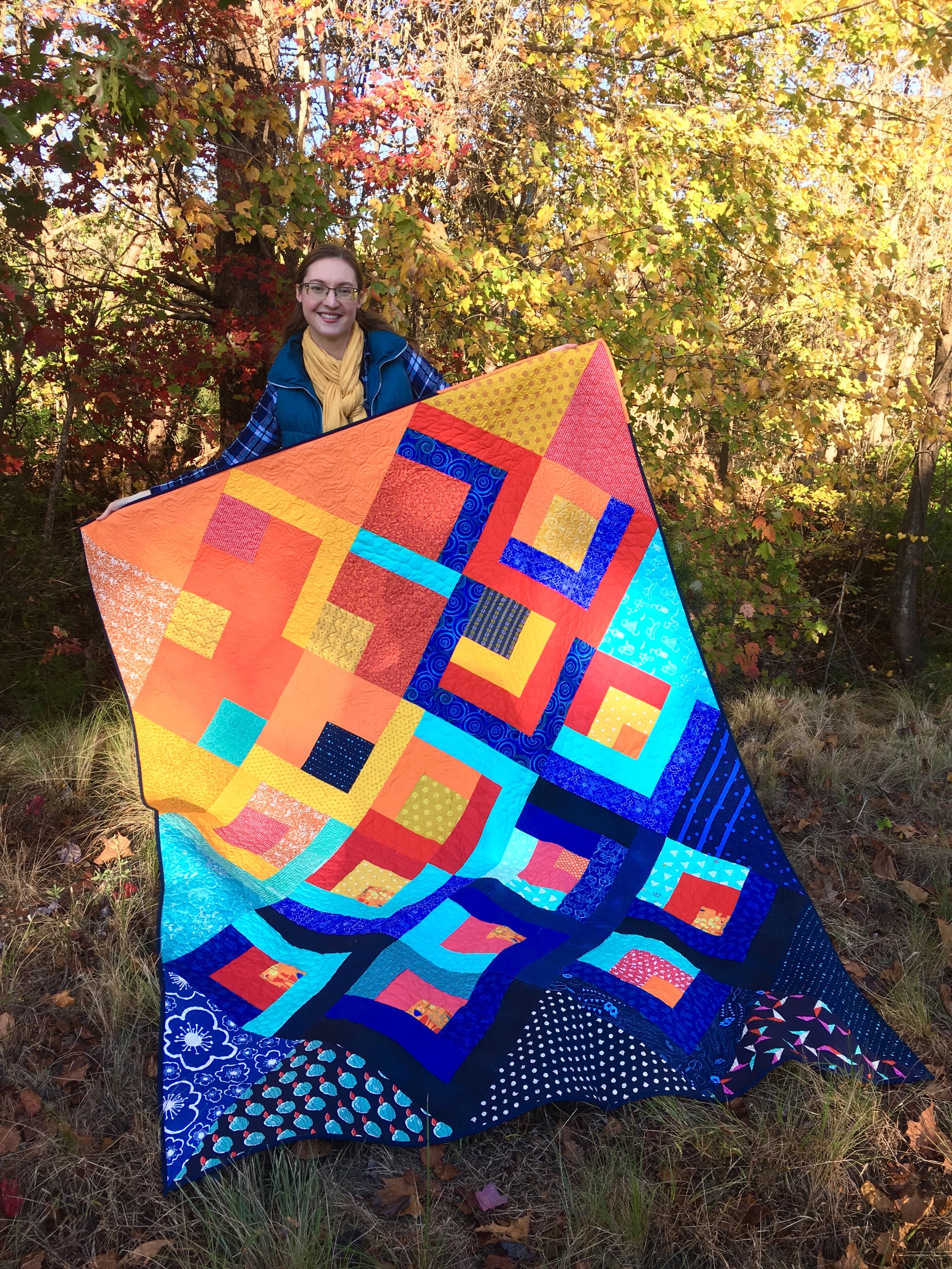
2) My second strategy is to look at nature. Pick a flower, a landscape, an animal, and identify the colors it contains. The classic Lanterns of Hope kit mocked up above mimics a sunset, moving from the bright colors of the sun itself, through the reds, oranges, and purples of a surrounding sky.
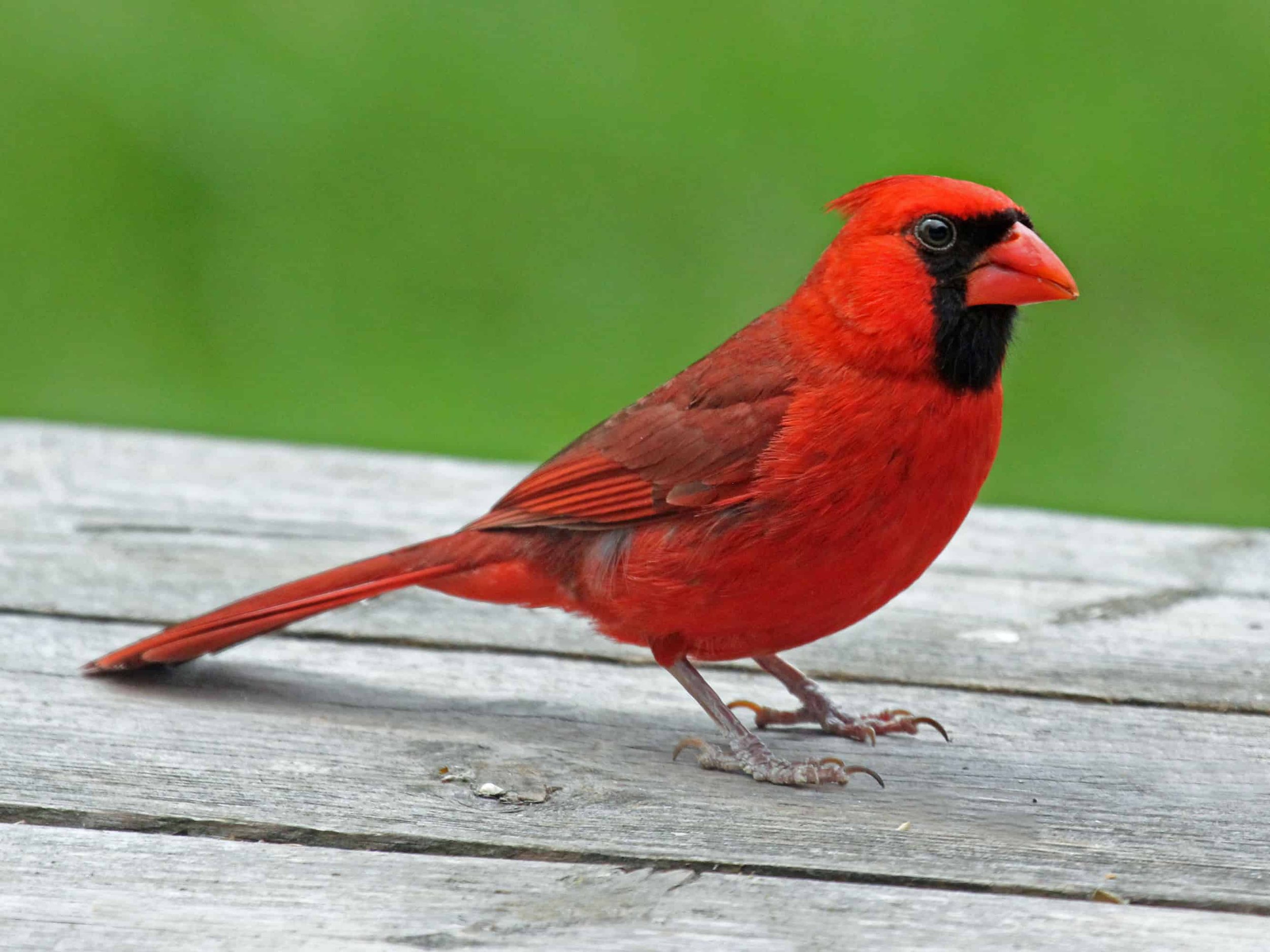
As you can see, nature is an accessible mine of inspiration. This male cardinal (picture from the Indiana Audubon Society) contains a splendid palette of reds and neutrals that makes a striking quilt.
Scale
Finally, if you are drawn to print fabrics, we need to consider the scale of the prints. Tone on tone prints are the easiest to work with because they behave similarly to solids. For Lanterns of Hope, the most important consideration is the prints for the setting triangles. Prints that have too many colors may look muddy or distracting when cut in large pieces. My Lanterns of Hope Water quilt has dynamic prints but only the fish have a lot of contrast and extra value. The second example, “Jem’s Lanterns of Hope” was an experiment in bold. bold. bold. It creates a much scrappier effect that may not be everyone’s cup of tea. If you’re unsure, I recommend making a sample block or two before settling on prints.
Closing Thoughts
I stated at the beginning that eight colors/ fabrics is a lot for a quilt. I hope these tools of value, color, and scale have given you some inspiration as you set out to choose your colors and fabrics for Lanterns of Hope. We have kits for many of the samples shown today if one of them struck your fancy, and more resources below for shopping and busting your stash. Huzzah!
Resources
Lanterns of Hope Pattern & Kits
Lanterns of Hope Quilt A Long
BLOG: Choosing Fabrics Series
BLOG: Why Contrast Matters When Choosing Colors for Your Quilts
BLOG: How to Shop Your Stash